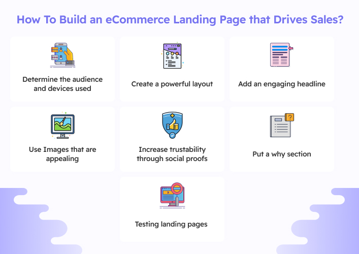
How To Build an eCommerce Landing Page that Drives Sales?

Here are some general guidelines for improving landing page conversion, but remember that they should be adapted to your specific audience and their specific requirements.
Determine the audience and devices used
One place to start with conversion rate optimization is by tailoring your landing page content to each user’s device type. You may understand where your traffic originates from and what sort of device your visitors prefer to purchase with the aid of Google Analytics.
If the vast majority of your visitors are accessing your site from their mobile phones, your landing pages should be designed with that in mind. Alternatively, you might create a landing page that improves the desktop experience by learning that your customers prefer desktops.
Create a powerful layout
The layout of your eCommerce landing page should be your top concern. You need to create an unforgettable experience if you want your online store’s landing page to convert visitors into buyers. One of the greatest practices for creating a landing page for an online store is to give it a custom look tailored to your brand.
Aesthetically pleasing and functional, a well-designed page will boost sales. Use pictures, but don’t pack the text with them. Furthermore, highlight just the most essential details. Lastly, make sure there is a compelling CTA.
Add an engaging headline
The best practices for eCommerce landing pages continue with the creation of a captivating title. A compelling title is an essential component in converting visitors into buyers on eCommerce landing pages. Think of the headline as an identifier/first impression; it sparks the interest of consumers and makes them want to learn more about the deal.
The subject of the page should be made clear in the headline. Furthermore, avoid using more than 20 words. The heading should also address issues that visitors are experiencing.
Use Images that are appealing
When words alone won’t do, turn to visuals like photos or videos to convey the key points. Images are more than simply filler for a website’s aesthetic. They’re essential for getting potential customers and site visitors to take action. Landing pages with high-quality photos have a higher conversion rate than text-only landing pages. However, it’s important not to overload the page with too many images.
Increase trustability through social proofs
Including user reviews and social proof on a landing page increases the likelihood that a visitor will trust the page. The number of people who have interacted with your company on social media is considered social proof. You may also include client testimonials on the page itself as a sort of social proof.
Put a why section
Explaining your product’s benefits in detail is made possible in the ‘why’ section. It has to explain what sets you distinct from rivals in terms of benefits, features, or advantages. You may make your message more compelling by focusing on the needs and interests of your target audience. In this area, you may highlight the ways in which your product or service will appeal to and meet the demands of your target audience.
Testing landing pages
Through testing, you may learn what will most likely appeal to your intended audience. You may test out alternative designs, color palettes, typefaces, images, and overall visual presentation to see which factors attract the most attention and lead to the most sales. This lets you cater the design to the tastes of your target demographic, which in turn increases the probability that they’ll do the required action.
Conclusion
A well-planned strategy is essential for the development of a functional eCommerce landing page. Headlines, images, text, and calls to action (CTAs) should all work together to interest and convert site visitors. You may further improve the performance of your landing page by including social proofs, making it mobile-friendly, and subjecting it to testing. With these tips in mind, you can build an engaging and highly effective eCommerce landing page that will propel the growth of your online store.
FAQs
Do ecommerce sites need a landing page?
Why do I need a landing page if I have a website?
What should a landing page consist of?
What makes a good landing page for ecommerce?
What is not recommended for a landing page?
Ravi Bhojani is the Chief Marketing Officer (CMO) at Alian Software, where he spearheads the company’s marketing strategies and drives its brand presence in the competitive IT services landscape. With over a decade of experience in the technology and marketing sectors, Ravi has consistently demonstrated his ability to blend innovative marketing techniques with deep industry knowledge to deliver outstanding results.